The Branding of Dearborn
Gallery

On Nov. 1, 2018, the City of Dearborn announced its new branding initiative and encouraged residents, business owners, employees, students, and more to fill out a survey sharing their special insights on the city. Over 1,900 individuals, including 30 stakeholders, offered their feedback to the question: “What’s Dearborn to you?” After one year, Mayor John O’Reilly, Jr. proudly unveiled the logo on Dec. 10, 2019.
“I was a bit taken aback at first,” Oliver, a graphic design student at Henry Ford College proclaims. “But, I think its simplistic design works for the modern era.”
The logo isn’t meant to replace the city’s seal which dons Henry Ford and an iconic antique car. The seal is used for legal purposes such as bills, birth certificates, official letterheads, and other legal documents. In fact, it’s illegal for other businesses to use the seal unless approved by the city.
Branding Dearborn seeks to promote the city by encouraging tourism and making it one of the most desirable cities to live in.
Funding for this branding project comes from the West Dearborn Downtown Development Authority ($179,000), the East Dearborn Downtown Development Authority ($147,500), City of Dearborn ($50,000), and corporate partners ($100,000). Almost half of the funds went to the development of the brand and the rest will be used to push out the brand during its initial years. The East and West Downtown Development Authorities (who spearheaded the project) hired Applied Storytelling, a marketing and advertising company based in Oakland, California, and Octane Design, a design firm from Detroit.
Mayor John O’Reilly, Jr. told Dave Herndon of the Dearborn Press and Guide, “Dearborn is a very welcoming community, with a strong sense of identity. We’re proud that people from many backgrounds have chosen us as their home and place to engage with neighbors in so many different ways. We have what you need here, and you’re close to the best the region has to offer. We’re known for our innovation, and we’re taking yet another forward-looking step by encouraging people to promote how great it is to be part of the Dearborn community, whether you live here, work here or invest here.”
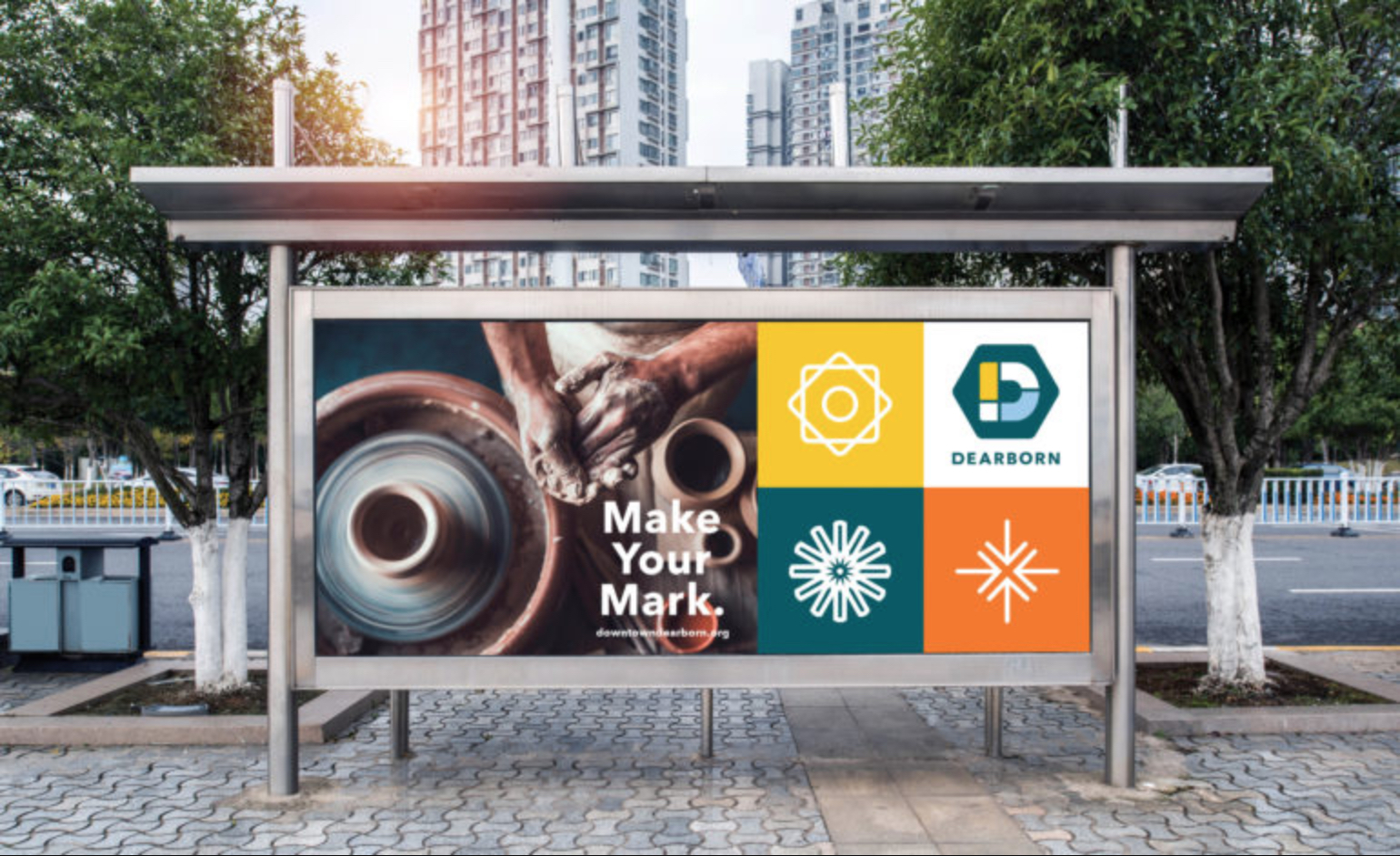
According to the Branding Dearborn website, the different shapes or “mosaics” that create the letter D represent vibrant neighborhoods and diversity throughout the city coming together to create one unified logo. The hexagon shape is inspired by the beehive structure as well as the bolts symbolizing community and hands-on innovation. And finally, the rounded corners form an approachable and friendly nature.
“Given the variety of socioeconomic demographics represented, this brand offers past, present and future residents and business owners the opportunity to rediscover Dearborn in a new way and strengthen community pride,” Cristina Sheppard-Decius, executive director of the East and West Dearborn DDAs, said on the city website. “The rollout of this initiative does not reflect an end to a process, but rather, a beginning opportunity to embrace and live out a brand that reinforces Dearborn’s legacy as a city defined by talent, drive and diversity.”
There were at least two focus groups that took place earlier this year which helped to shape which direction the marketing campaign was going to take, including the logo design. No changes to the logo have been announced. More information on Branding Dearborn, including the brand guide and assets, can be found on brandingdearborn.com.

